Still using the good old #FFF as a background color?
While the color white will always have its place and can bring an elegant and spacious feel to any design, sometimes it’s fun to add a bit of personality by replacing white with something that adds more character.
Today, I’m excited to share a favorite trick I use when designing websites and interfaces. It’s a simple change that you can easily implement on your website and brand: move away from using pure white.
Moving away from using pure white in your brand can have a significant impact on brand perception. By incorporating subtle off-white or cream tones, you can create a warmer, more approachable aesthetic that resonates with a wider audience. This small change can enhance the perceived trustworthiness and authenticity of your brand, making it more relatable and appealing.
You can experiment with different shades of off-white or cream for various brand elements, such as the background color, logo, or typography. This will allow you to create a cohesive and harmonious visual identity that still maintains a warm and approachable aesthetic. Don’t be afraid to play around and find the perfect shade that aligns with your brand’s personality and values.
The Harsh Truth of #FFF White
Pure white can certainly look classy and timeless, but it can also be harsh on the eyes. The brightness of pure white creates a glare effect, which can be uncomfortable, especially when there’s a lot of it on the screen. It’s like staring into a flashlight for too long—not a pleasant experience!
The stark contrast of pure white against other elements can lead to eye strain and discomfort, especially in low-light environments. This isn’t ideal for user experience on websites.
Create brand-ready color palettes in seconds with Color Palette Pro with code: HAPPYCOLOR10
Exploring Alternatives to White Backgrounds
When considering an alternative to a white background website, it’s important to choose shades that still maintain a clean and professional look but with less strain on the eyes. Finding the best white background color for your website can make a significant difference in both aesthetics and user experience.
15 Colors to Use Instead of White in Graphic Design
Looking for shades of white for website backgrounds? Here are some subtle shades of white that you can use for your website background. These alternatives provide a softer, more inviting look while still keeping the design bright and clean.
There is a wide range of color alternatives to pure white. In web design, these colors can create a welcoming and visually appealing design without overwhelming the viewer.
So, let’s dive into 15 favorite alternatives to pure white along with their HEX codes. These shades offer a perfect balance of elegance and usability, ensuring your designs are both beautiful and comfortable for your audience.
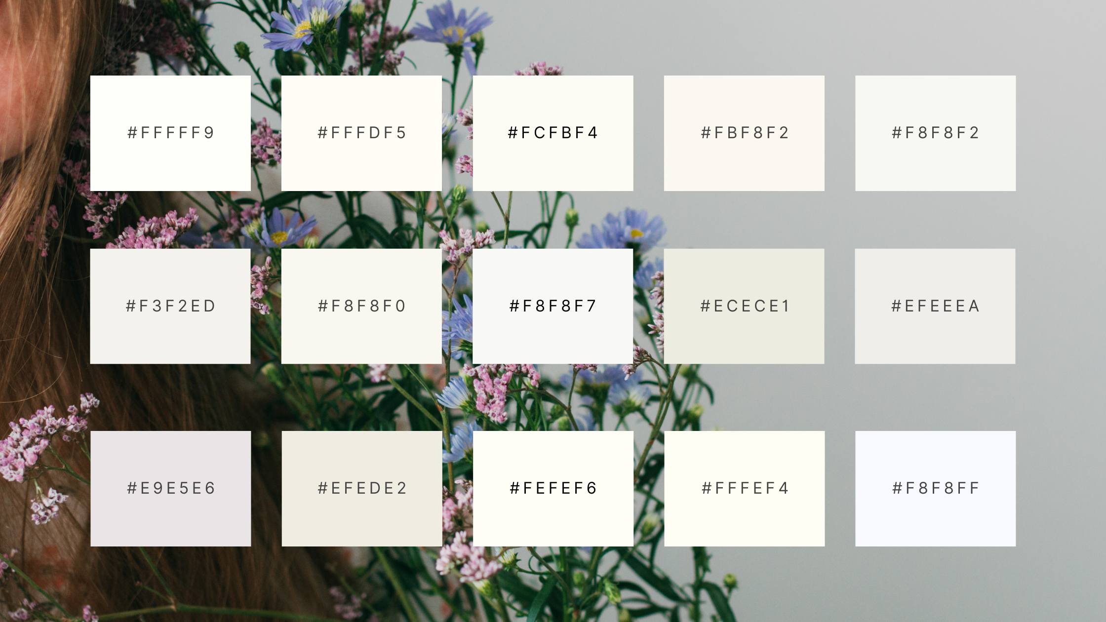
1. Alabaster White #FFFFF9
Very soft white with a hint of warmth.

2. Ivory Lace #FFFDF5
Delicate white with a subtle creamy tone.

3. Eggshell White #FCFBF4
Classic eggshell shade, perfect for a timeless look.

4. Vanilla Cream #FBF8F2
Warm, inviting white with a touch of vanilla.

5. Warm White #F8F8F2
Soft white with a slight warmth, ideal for a cozy feel.

6. Foggy White #F3F2ED
Muted white with a hint of gray, creating a foggy effect.

7. Pearl White #F8F8F0
A touch of warmth

8. Soft White #F8F8F7
Versatile, soft white perfect for various design needs.

9. Bone White #ECECE1
Light, earthy white that adds a natural touch.

10. Chiffon White #EFEEEA
Delicate, airy white with a touch of chiffon.

11. Seashell Beige #FAF5F6
Soft beige white with a hint of Seashell.

12. Cream White #EFEDE2
Creamy white that brings warmth and softness.

13. Snowdrift #FEFEF6
Pristine white reminiscent of freshly fallen snow.

14. Linen White #FFFEF4
Light, linen-like white perfect for a clean look.

15. Ghost White #FAFAFA
Very light grayish-white, perfect for minimalistic designs.

Create brand-ready color palettes in seconds with Color Palette Pro with code: HAPPYCOLOR10