Squarespace 7.1 introduced a new feature that generates interesting background designs for page sections. Additionally, the latest update includes a Section Divider feature, adding more design options.
What can you do with art backgrounds in Squarespace?
The art background feature allows you to add gradient background to a section, or other interactive animations. It’s cute, super easy to use and very useful!
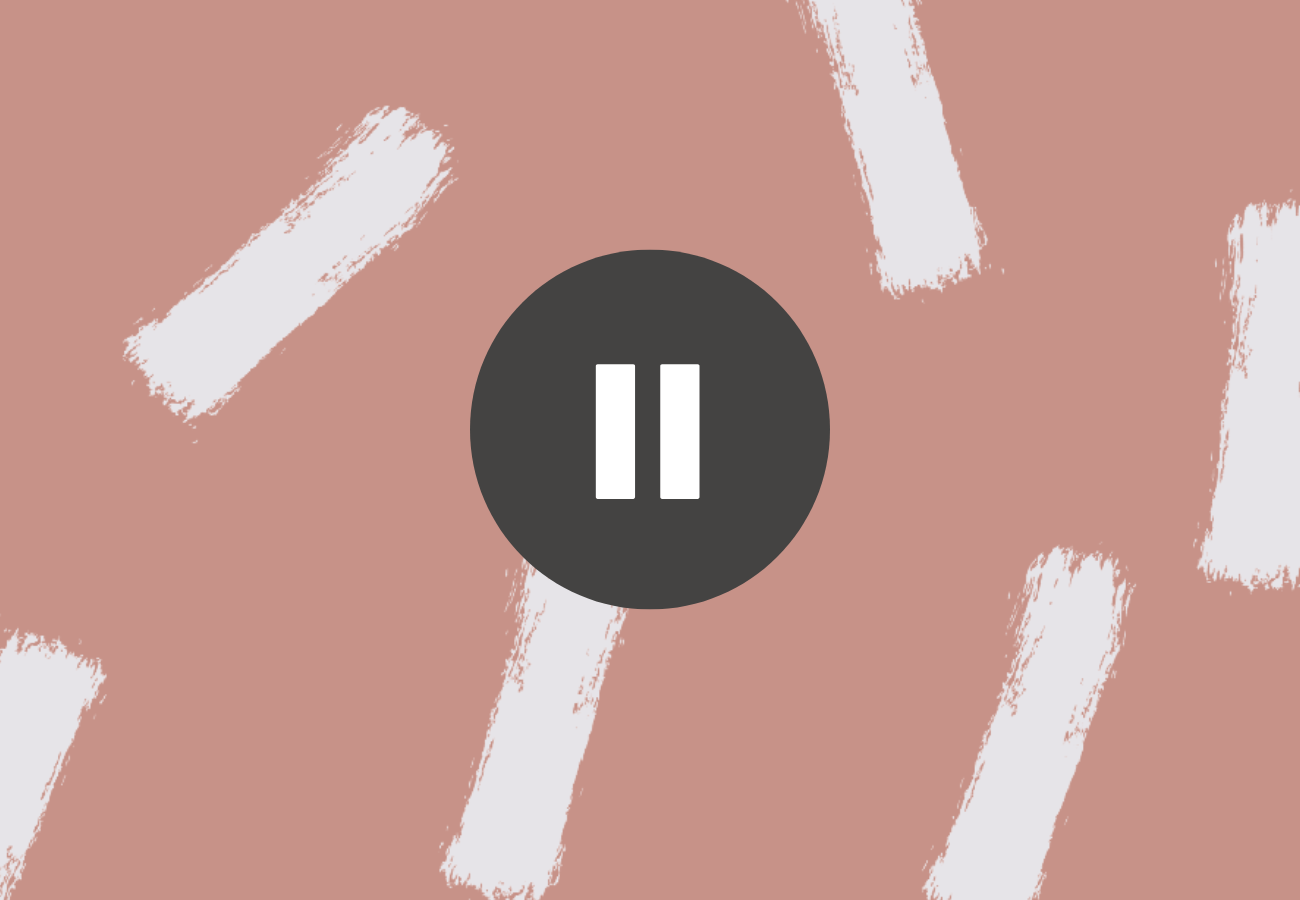
However, If you have background art enabled for a page section on your site, you might have noticed a pause/play button at the bottom right corner. This button is straightforward and can be easily customized or hidden using CSS.
In this tutorial, I’ll show you how to completely hide the button, change its shape, or alter its color to better fit your design preferences. But first things first – why does this button exist in the first place?
why you should consider keeping the pause button on art background
In Squarespace, the pause button on background art allows users to stop animations. This feature is important for improving the user experience, as animations can be distracting or uncomfortable for many, especially for users with disabilities.
In fact, the Web Content Accessibility Guidelines (WCAG) recommend always including a play-pause option for any non-essential elements that flicker or move across the screen.
While these guidelines make sense, sometimes keeping that button isn’t an option for aesthetic reasons. I mean, the button looks awful and is hard to ignore (to the point where it ruins the beautiful art effect).
So if you do want to hide the pause button, use the following CSS code:
.background-pause-button.visible { display: none !important; }

