Have you noticed one thing common to many web design trends? They come and go. What was popular yesterday now looks outdated. However, certain trends leave a lasting (sometimes nostalgic) impression. Neo Brutalism is one such trend.
Neo Brutalism stems from Brutalism–an architectural movement from the mid-20th century. Later on, many other branches of human creativity embraced this style, and that’s how Neo Brutalism was born. For example, we now have a neo-brutalist web design, which captures the eye with a raw, unconventional, and bold look. You get the idea.
Curious about Neo-Brutalism and how it shows up in web design? Please read on. We will explore Neo-Brutalism’s roots, defining features, and its growing appeal.
Origins Of Neo Brutalism
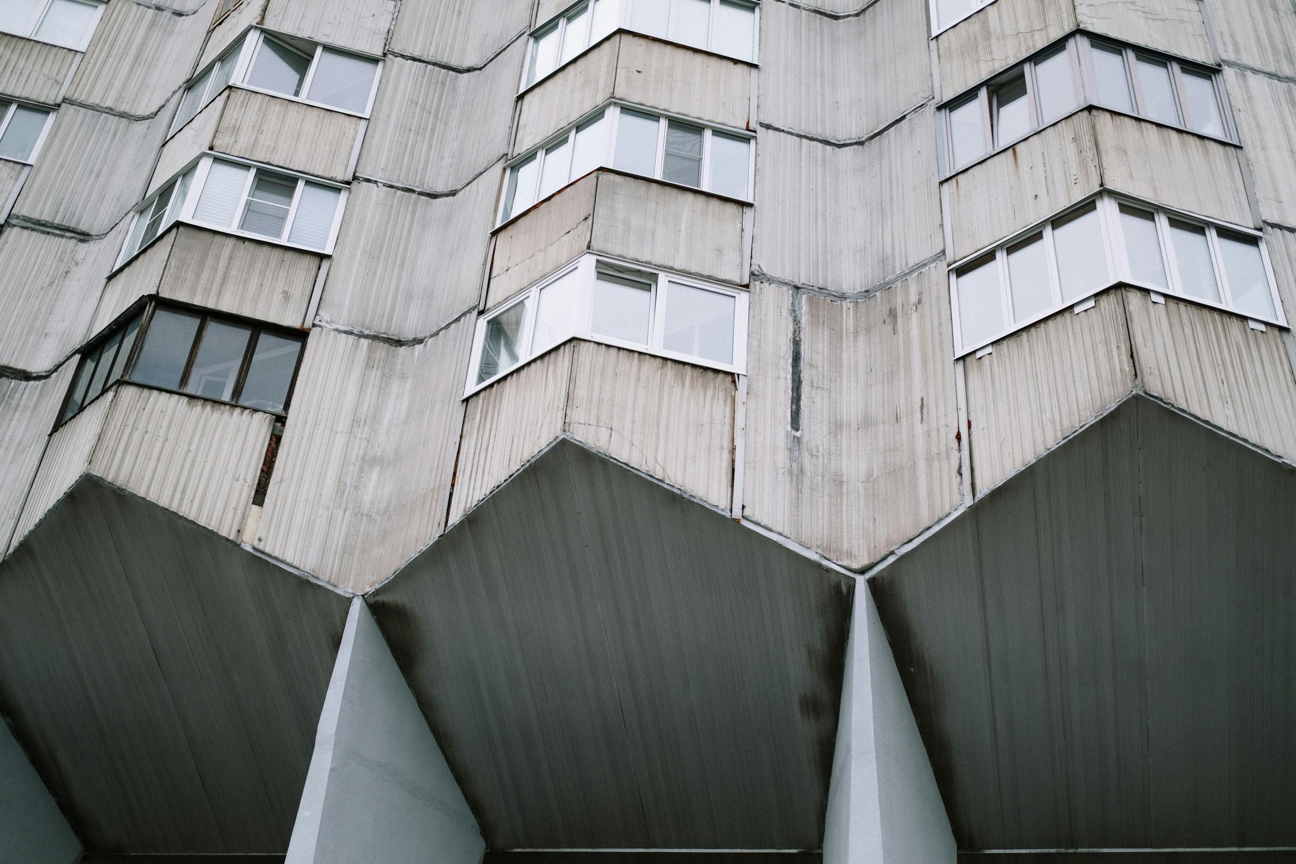
As mentioned above, Neo Brutalism finds its roots in the Brutalism architectural movement, which emerged in the mid-20th century as a response to the International Style. Its use of raw concrete, imposing structures, and a focus on functionality characterized it.
As such, Brutalism challenged traditional notions of architectural beauty. And Neo-brutalism in web design takes inspiration from these principles. This adopts a raw and unfiltered aesthetic in the digital space, yet this looks refined and modern.
Neo Brutalism In Web Design: Characteristics And Elements
So, you’re probably wondering: how can I recognize Neo-Brutalism? Well, once you learn to recognize Neo brutalism colors, typography, and layouts, you’ll start spotting neo brutalism elements eveywhere.
Neo Brutalist elements in web design:
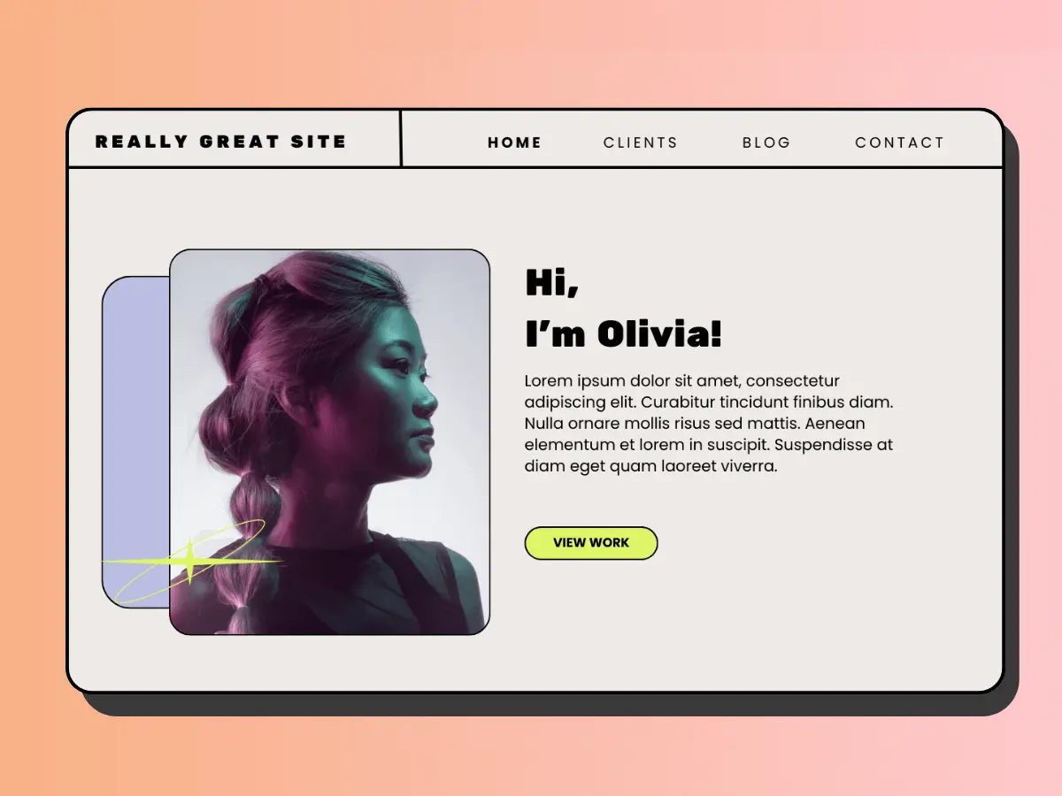
- Raw and Unfiltered Aesthetic: Neo Brutalism often features a stripped-down, unpolished design instead of traditional, sleek, and polished interfaces.
- Bold Typography: Large, sans-serif fonts in vibrant colors dominate Neo Brutalist websites, creating a strong visual impact and enhancing readability.
- Asymmetry and Irregular Grids: Neo-Brutalist designs break away from the conventional grid structure. Look for irregular layouts and asymmetrical elements that provide a sense of visual chaos.
- High-Contrast Color Schemes: Vibrant and high-contrast color palettes are a hallmark of Neo Brutalism. This makes Neo Brutalist websites a visually striking experience for users.
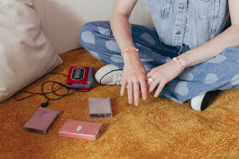
One of the most intriguing aspects of Neo Brutalism in web design is its unmistakable retro vibes. In a way, it is similar to the early 2000s internet aesthetic. The deliberate use of pixelated graphics, unconventional layouts, and vibrant colors pays homage to the internet’s earlier days. As such, it evokes a sense of nostalgia for those who witnessed the birth of the World Wide Web (Hi there 👋).

Target Audience For Neo Brutalism Web Design
Obviously, Neo Brutalism may not be suitable for every industry or brand. Still, it can be a perfect fit for making a bold and memorable statement. Here are some target audiences that can benefit from embracing the Neo Brutalism trend:
⚡ Certain fashion Brands (Sneakers?)⚡
The bold and unconventional nature of Neo Brutalism can resonate well with sneaker enthusiasts. When you look at it, you see how it captures the essence of the streetwear culture.
⚡ Tech Blogs & Startups ⚡
Embracing a cutting-edge and unconventional aesthetic, Neo Brutalism can be the perfect choice for tech-related blogs and startups aiming to stand out in a crowded digital space.
⚡ Creative Agencies ⚡
Design-centric creative agencies can use Neo Brutalism to showcase their innovative and unconventional approach to creativity.
⚡ Music & Entertainment⚡
Neo Brutalism’s vibrant and chaotic design elements can complement the dynamic and energetic atmosphere of music and entertainment websites.
Overall, Neo Brutalism is a perfect design choice for brands that want to stand out. Do you want to show the world how fun and exciting your product is? Then your website should reflect that. Neo Brutalism web design is unapologetically cool, yet it has the potential to become timeless.
As the digital world continues to evolve, we keep pushing boundaries to make user experiences that stand out. Neo Brutalism offers a distinctive approach that resonates with specific audiences thanks to its raw aesthetic, bold typography, and retro vibes. Embrace this trend, and make a bold statement – because standing out is more important than ever.
Examples Of Neo Brutalism Web Design
Need some inspo for your new project? I’ve picked a few examples of Neo Brutalism web design created by talented designers. These examples demonstrate how Neo Brutalism web design, with its unrefined and unconventional design principles, can create visually striking and memorable digital experiences:
1 – Robinhood – Neo Brutalism Design In Trading And Investment
I mentioned before how Neo Brutalism design might not be everyone’s cup of tea. Some industries still prefer more traditional web design trends, and that is perfectly fine. However, here is a great example of a company from a more traditional industry (finance, investing) that was brave enough to embrace the bold, Neo Brutalist style:

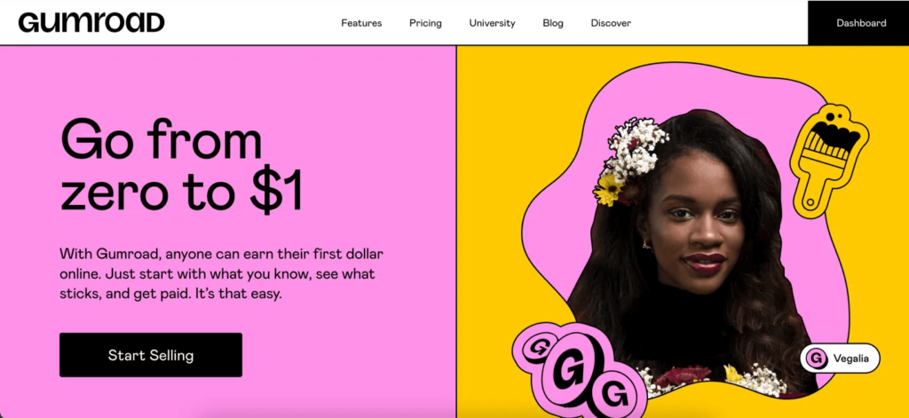
2 – Gumroad – Modern Marketplace With A Modern Design
Now, you probably think the examples above are large companies with unlimited budgets for design. What about smaller companies and brands? Can they expect great websites with Neo Brutalism aesthetics? Well, take a look at this landing page UI design – it is quirky, unique, striking, and cool. With a good web designer, even smaller companies and brands can have Neo Brutalism websites.
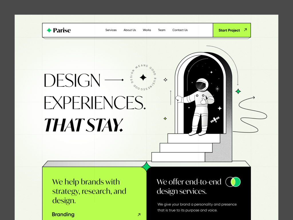
3 – Landing Page UI Design For Parise (Dribble)
Now, you probably think the examples above are large companies with unlimited budgets for design. What about smaller companies and brands? Can they expect great websites with Neo Brutalism aesthetics? Well, take a look at this landing page UI design – it is quirky, unique, striking, and cool. With a good web designer, even smaller companies and brands can have Neo Brutalism websites.
Neo Brutalism Color Palettes
Neo-brutalism in web design is a style that emphasizes boldness, stark contrasts, and minimalist elements. It’s an aesthetic that aims to break away from overly polished or smooth designs, embracing a more raw and unrefined look. When considering color palettes for neo-brutalism, think of colors that can evoke strong visual impacts while still maintaining a sense of simplicity. Here are some color palette suggestions that align with this style:
Common Neo Brutalism Color Palettes For Web Design
These palettes should give you a good starting point for creating a neo-brutalism-inspired web design. Depending on your preference, you can adjust the saturation or brightness to find the ideal contrast and visual impact.
Create brand-ready color palettes in seconds with Color Palette Pro with code: HAPPYCOLOR10
1. Monochrome With Pops Of Bright Colors
- Base Color: Black (#000000), White (#FFFFFF), or Gray (#808080)
- Accent Colors: Bright Yellow (#FFD700), Red (#FF0000), Blue (#0000FF), Neon Green (#39FF14)
2. Bold Primary Colors
- Primary Colors: Red (#FF0000), Blue (#0000FF), Yellow (#FFFF00)
- Secondary Colors: White (#FFFFFF) or Black (#000000)
3. High-Contrast Dark Tones
- Base Colors: Dark Gray (#404040), Charcoal (#2C2C2C), or Black (#000000)
- Accent Colors: Electric Blue (#1E90FF), Deep Purple (#800080), or Bright Red (#FF0000)
4. Grayscale With Neon Highlights
- Base Colors: Light Gray (#D3D3D3), Medium Gray (#A9A9A9), Dark Gray (#696969)
- Accent Colors: Neon Pink (#FF69B4), Neon Green (#39FF14), or Bright Orange (#FFA500)
5. High-Contrast With Bright Accents
- Base Colors: White (#FFFFFF) or Off-White (#F5F5F5)
- Accent Colors: Red (#FF0000), Blue (#0000FF), Yellow (#FFFF00), or Bright Green (#00FF00)
Neo Brutalism Typefaces And Fonts
Neo-brutalism is all about bold, no-frills design, so you want fonts that are strong, simple, and eye-catching. Here’s a list of font suggestions from Google Fonts that you can use on Squarespace or other platforms to get that minimalist, edgy vibe. These fonts are all about clean lines, big impact, and a little bit of attitude.
1. Anton
- A bold, condensed sans-serif typeface that makes a strong statement. Great for headlines or attention-grabbing text.
2. Bebas Neue
- Similar to Anton, Bebas Neue is a highly condensed sans-serif font. It’s clean, bold, and ideal for large headings.
3. Rubik
- A slightly rounded sans-serif font with a strong presence. It offers a bit more versatility while maintaining a bold look.
4. Montserrat
- A popular geometric sans-serif font with a strong presence. It comes in multiple weights, making it flexible for both headings and body text.
5. Oswald
- A reworking of the classic gothic typefaces, Oswald has a condensed and bold appearance. It can be used for headings and subheadings to emphasize the neo-brutalism aesthetic.
6. Poppins
- A geometric sans-serif with a contemporary feel, Poppins offers a more modern approach while keeping things bold and minimalist.
Font Pairings For Neo-Brutalism Design
- Anton with Roboto: Use Anton for headings and Roboto for body text. Roboto is a versatile sans-serif font that’s highly readable.
- Bebas Neue with Lato: Bebas Neue for headings and Lato for body text. Lato provides a softer sans-serif contrast to Bebas Neue’s boldness.
- Rubik with Source Sans Pro: Rubik for headings and Source Sans Pro for body text. Source Sans Pro has a slightly softer appearance, offering balance.
- Montserrat with Open Sans: Montserrat for headings and Open Sans for body text. Open Sans is a widely used sans-serif that’s readable and versatile.
- Oswald with Raleway: Oswald for headings and Raleway for body text. Raleway has a lighter, elegant feel that complements Oswald’s boldness.
All these fonts are available in Google Fonts, making them easily accessible for web design projects, including Squarespace. Experiment with different combinations to find the one that suits your neo-brutalism-inspired design best.


